Our existing customers know, that a few years ago ERP PRO SIA has purchased the company Aston Baltic SIA, all this time we have worked shoulder to shoulder, keeping the two legal entities. It took a little bit time to have decided, that the future operations will take under new name and image - Aston Baltic and the previous brand including a legal form after some time will be stopped.
The company's new logo design and the graphic elements.
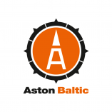
The new logo retains Aston Baltic already recognizable elements - the company Aston Baltic letter shape and the company ERP PRO logo orange color.
Graphic symbol designed based on the concept of Enterprise Resource Planning (ERP) = enterprise planning + management, so it is abstract and reduced board compass and steering wheel symbol combination - they are symbols, that most closely corresponds to the meaning of the ERP.
In our opinion the steering wheel, both directly and symbolically means management. To run a business is like drive the ship - with the steering wheel is not enough, you need a compass, that accurately shows right direction. Compass, both directly and symbolically helps orient and not to deviate from right target.
In turn, the stylized letter A in the center, very similar to the arrow of the compass.
News
We have launched name and brand name change process.
27.06.2016.
From 2016, on 10 June, we will continue our operations under a new company name, and from that moment our company name is Aston Baltic (with a new logo). In this respect, it is also changed our visual identity to better emphasize our qualities, values and goals. To commence the process in the near future will bring other new changes regarding those first changes...